A new Brand Identity
As part of the realignment of our Group, a holistic brand relaunch is taking place, through which integrates our strategic core themes also visually in our corporate design. The new brand picks up on our vision and mission, our core theme Circularity, transformation and renewal in all areas. It visualizes our values and strategy in all its individual elements, which when put together create a well thought-out and unified overall image. Circularity is a central theme of Strategy 2030.
This is also reflected in our definition of the circular cycle: "The Salzgitter Group defines Circularity as keeping resources once extracted from nature in economic use as long as possible, and thus to minimize the additional introduction of finite resources into the economic cycle."
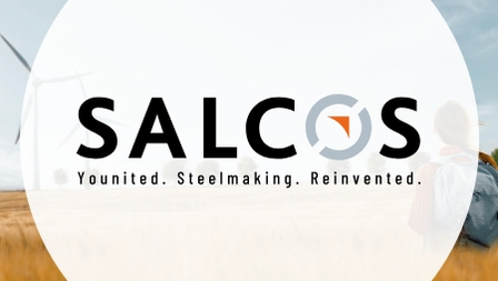
The figurative mark – a common factor
Every detail of our brand identity has a common denominator: our figurative mark! In its design language, color scheme and symbolism, it unites everything that makes us what we are. A triad as a symbiosis - representing the core themes of Salzgitter AG: people, steel and technology. The people, as pioneers and creators, are at the center of our vision. They guide the mission in which industry, our technology and our products are brought into a new era.

Expressive brightness
Color scheme
A luminous warm orange is still at the center of our figurative mark and ensures the absolutely essential recognition factor of Salzgitter AG. It is surrounded by a technically neutral blue-gray that symbolically visualizes the central pillars of our identity: steel and technology.
Old and new colors – The main players orange, blue-grey, white and black are joined by an extensive color palette directly linked to the production processes. They are all derived from the tempering and annealing colors used in steel production.

Future-oriented and optimistic
Typography
SZAG Bliss Pro - A font that points to a positive future. With its new brand identity, Salzgitter AG is getting its own font - a self-confident typeface with recognition value. It is derived from basic geometric forms and captivates with its positively running ends. SZAG Bliss Pro is used in the typefaces Extra Bold and Light.
Slanted, upward ends and straight edges establish the relationship to the figurative mark as well as the vision and mission. Round shapes visualize the content core of our vision – the Circular Economy.

Custom-made iconset
Graphics
The construction of the icons is based on the figurative mark and the house font SZAG Bliss Pro. It incorporates the curves and ends of the font. This creates a unified form language between logo, font and graphics and thus ensures a harmonious overall image.
The alignment of the circle opening is based on the optical alignments of the respective motif. The size of the gaps corresponds to the gaps in the logo.
Our identity – People, steel and technology
On our journey to becoming Europe's strongest steel and technology group, we place people at the center of our self-image. Surrounded by steel and technology, we form a triad that is always in motion.
Lines – the figurative mark in a circle
The basic shape of the figurative mark is circular. It symbolizes Circularity, the movement, cycles and all processes in our Group. The triangle in the center pointing upward to the right is oriented toward the future. The two openings make room for new opportunities on the journey to a successful future.


