
Page 23 - STIL 4 2022
P. 23
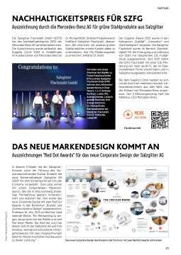
 NACHHALTIGKEITSPREIS FÜR SZFG
Auszeichnung durch die Mercedes-Benz AG für grüne Stahlprodukte aus Salzgitter
Die Salzgitter Flachstahl GmbH (SZFG) hat den Nachhaltigkeitspreis 2022 der Mercedes-Benz AG verliehen bekommen. Die Auszeichnung wurde anlässlich des Supplier Circle 2022 in Sindelfingen im Kundencenter von Mercedes-Benz an
Dr. Michael Brühl, Direktor Produktbereich Kaltflach Salzgitter Flachstahl, überge- ben. „Wir sind stolz, mit unseren grünen Stahlprodukten unsere Kunden dabei zu unterstützen, ihre CO2-Minderungsziele zu erreichen“, erklärte Dr. Brühl.
Vertreter und stolze Gewinner der BayWa r.e. Power Solutions GmbH (IPS) und der Salzgitter Flachstahl GmbH (MP) nehmen die Lieferanten- auszeichnung in Emp- fang (v. l. n. r): Andreas Burkhart, Leiter IPS, Andrea Grotzke, Leiterin globale Business-Unit Energy Solutions,
Dr. Michael Brühl, Betriebsdirektor bei Salzgitter Flachstahl, Gunnar Güthenke, Leiter MP
Der Supplier Award 2022 wurde in den Kategorien „Qualität“, „Innovation“ und „Nachhaltigkeit“ vergeben. Die Salzgitter Flachstahl wurde im Bereich „Nachhal- tigkeit“ für die Erzeugung und Lieferung von Stahl mit reduziertem CO2-Fußab- druck ausgezeichnet. Seit 2021 liefert die SZFG Flachstahl mit einer CO2-Min- derung von mehr als 60%, der im Elek- trostahlwerk Peine erschmolzen und in Salzgitter ausgewalzt und veredelt wird.
Bei dem Supplier Circle handelt es sich um ein Event mit mehreren Hundert Lie- ferantenvertretern aus aller Welt, das der Einkauf von Mercedes-Benz organi- siert. Den Einführungsvortrag hielt Ola Källenius, CEO Mercedes-Benz.
MEHR ZUM THEMA
t1p.de/spcmb
PARTNER
 DAS NEUE MARKENDESIGN KOMMT AN
Auszeichnungen "Red Dot Awards" für das neue Corporate Design der Salzgitter AG
In diesem Frühjahr hat der Salzgitter- Konzern unter der Führung des Vor- standsvorsitzenden Gunnar Groebler die neue Konzernstrategie „Salzgitter AG 2030“ mit dem Schwerpunkt auf Circular Economy vorgestellt. Dies ging einher mit einem tiefgreifenden Markenre- launch, den die in Braunschweig ansäs- sige PierraaGroup geplant, konzeptio- niert und realisiert hat. Nun wurde das neue Corporate Design mit zwei Red Dot Awards in den Bereichen „Brands“ und „Communication Design“ ausgezeichnet. Professor Dr. Zec, CEO von Red Dot, fand lobende Worte: "Ein Rebranding zu wa- gen, zeugt stets von der Stärke und vom Mut einer Marke. Die Red Dot Jury hat diesen Schritt der Salzgitter AG und ihre kreative, wenngleich konsistente Heran- gehensweise mit zwei Auszeichnungen belohnt. Meinen herzlichen Glückwunsch zu dieser Leistung.”
Das neue Corporate Design des Konzerns darf sich nun mit zwei Red Dot Awards schmücken
  AT THE CENTER OF THE TRANSFORMATION
The new brand based on the Strategy 2030 and its Group vision and mission
Vision:
P i o n e e r s Mission: Partnerships
People Steel Technology
becomOinngouEruwroapyet`os strongest Steel and Technology Group, we place people at the center of our self-image.
CIRCULARITY
The new product cycle as basis for the new Brand Experience
WReEwDilUl bCeEeven more coofnfisnciitoeurseisnouorucreussaend t t h h u e s e mc o i n n o i m m i i z c e c t i h r e c ml e . i n
RECYCLE
To save resources
we make raw materials fprromduacltrseaudsyabulseeadgain.
VISION AND MISSION
Our strategy defines clear goals and leads us to a strong brand
     „The Salzgitter Group defines Circularity as keeping resources once extracted from nature in economic use for as long as possible and thus, minimizing the athdedietcionaolminictrcoydculcet.iFoonrotfhfisinrieteasroens,outhrececsiricnlteo is
a very important graphic element for our brand.“ Gunnar Groebler // Chairman of the Executive Board
01
Our vision is the central core content of the strategy:
To establish Salzgitter AG as a leading company in the Circular Economy World. Tchaellsetnragtesg.yTihseopueropblje,cotuivreeamnpdlpoyoeinets, tphlaeywaacyefnotrrwaal rdolien. all our daily APeftoeprlaell,eoandlythweitwhatyhaesmpcioaneweersi,mspeltetmhendtiroeucrtivoinsiaondamndamkeission. astcalretainrgcopnotinritbfuotriouns wtoitchotnhteinirudeatiolydweovreklo. Ppepopslietiaverelythe
and sustainably as a community.
Derived from that, the mission formulates
our new entrepreneurial claim.
2030
We have formulated our mission in such a way that it underlines the importance of the interplay between all business units, products, technologies, employees and partnerships.
Like us, our supplier and customer industries are facing the tasks of the future. Tthoigsettrhaenrs,fworemwaatniotntofoprrwoavridetotghetnhecrescsoanroymimicpaeltlyuasnfodrscuhcacnegsesfiunlloyr.dWeer twoadnrtive taondsuppaprotnrteresahcihpso.ther across industries and move forward through cooperation
Iimn oprodretarntot isntaoyrdaehretaodinincothrpisocrahtaenagew,iadecovnatrineutyooufspeexrcshpaencgteivoefskintoowoleudrgweoirsk and to receive additional impulses from the outside.
A success that is build on each other.
Characterized by different strengths and the same values.
PIONEERING FOR CIRCULAR SOLUTIONS
“Together we will resolutely chart new courses, transform industry and create sustainable value for the future.”
     Previous figurative mark
STRATEGY 2030
Circularity
The basic shape of the figurative mark is circular. It stands for the core theme of Circularity, movement, cycles and all processes in the Group.
The triangle in the center pointing upward to the right is oriented towards the future. The two openings provide space
for new opportunities on the way
to a successful future.
A NEW IDENTITY
Transformation
THE VISION
Pioneering
The elements of the figurative mark are rethought: The orange centerpiece in the middle represents the people. As a pioneer, they enable the vision to succeed. The direction of the arrow represents the market leadership for Circular Economy Solutions:
It points resolutely upwards.
New figurative mark
THE MISSION
Partnering
The two wings of the figurative mark show the cornerstones of the Group: Steel and Technology. In this way, the diverse partnerships named within our mission also become visible.
They frame the central factor, people. The vision is protectively accompanied by the mission.
Our identity
PEOPLE, STEEL AND TECHNOLOGY
OUR NEW
TYPOGRAPHY
Future-oriented and optimistic
SZAG Bliss Pro – a font that
points to a positive future.
With its new brand identity Salzgitter AG is getting its own font- a self-confident typeface with recognition value. It is composed of basic geometric shapes
RETHINK
Wa n e d q p u r e o s c t e i o s n s e o s u a r n h d a b i t s
dinedvueslotrpiaal sourgsataniinzabtiloenal structure.
0 4
  02
REUSE
Wonecwe iellxktreaecpterdesforuormces nfoartuarseloingecaosnpoomsiscibulsee.
   03
       The new Brand Relaunch supports the new strategy of Salzgitter AG
As part of the realignment of the Salzgitter AG, a fundamental Brand Relaunch is taking place. This visually reflects the strategic core themes in the Corporate Design.
The new brand takes up the vision and mission as well as the core theme of Circularity in all areas. It visualizes the values and the strategy comprehensively and results in a well thought-out
and consistent overall image.
Circularity is a central theme of the Strategy 2030.
This is also reflected in the definition:
„For Salzgitter AG, Circularity means to keep resources once taken from nature,
in economic use for as long as possible and thereby, minimizing the additional supply of finite resources to the economic cycle.“
In all areas of brand identity, there is a common denominator: The figurative mark!
COMMON DENOMINATOR
THE TRIAD
Facing forward
In its design language, color scheme and symbolism, the figurative mark unites everything that defines the Group.
A triad - representative of the core themes of Salzgitter AG: People, Steel and Technology. People are at the heart of the vision.
They guide the mission, in which industry, technology and products are transformed into a new era.
PEOPLE
STEEL TECHNOLOGY
THE NEW BRAND PRESENCE
And its most important basics for a unique Brand Experience
TEMPER AND ANNEALING COLORS OF STEEL PRODUCTION
Black
White Orange Grey
THE CIRCULAR BRAND
Becoming Europe‘s strongest Steel and Technology Group
LANGUAGE OF FORMS
GRAPHICS
An icon set made to measure
The construction of the icons results from the figurative mark and the house font SZAG Bliss Pro.
It incorporates the curves and
ends of the font. This creates a uniform language of form between the logo, typeface and graphics and ensures a harmonious overall image.
“We are the market leader for circular economy solutions in global industrial value chains with
our ianndovparoticvespsreosd.”ucts
PARTNERING FOR TRANSFORMATION
                E X T E N S I V E R A N G E O F C O L O R
CONCLUSION
A Circular Brand creates an innovative future
Becoming Europe‘s strongest Steel and Technology Group, Salzgitter AG sets previously unknown standards. The Group has reoriented itself and uses the Corporate Design for the visual transfer of the strategic core themes.
Tfirgaudriatitoivneaml aanrdkcuonndseirsltineenst,tahtethGerosuapm‘seidteimnteitmy.oTdheernthaindkifnugtuahre-aodrioefntheed,etxhiestninegwbasis reflects the courage to transform. People as pioneers and in the focus of the vision are symbolically placed as a triangle in the center of the figurative mark. Surrounded by Steel and Technology, which together visualize the partnerships and therefore the mclaisimsio. nThoef tbhaesiAcGs.hTahpetorfiatdh:e„Pfiegoupralet,ivSetemeal raknidnTtehcehfnoormlogoyf“afocrimrcslethrepGrerosuepn‘tssntehwe focus theme „Circularity“ of the Group.
The figurative mark is the common denominator in all areas of Salzgitter AG‘s nTehwe cboralonrdsicdheenmtietywaansdaislscoodnesriisvtedntflryocmarthriedstoevelrpirnotdoutcytpiognrparpohcyeasnsdangdraphics. rounds off the harmonious overall impression.
WELCOME TO THE NEW SALZGITTER AG!
GROUP COLORS
With full luminosity
Old and new colors – The main players orange, blue-gray, white and black are joined by an extensive color palette that has a direct link to the production processes. All other colors are derived from the tempering and annealing colors, arising in steel production.
and captivates with its positively running ends. SZAG Bliss Pro is used in
the typefaces Extra Bold and Light. Due to its shape, it fits perfectly into the overall communication.
pG
  www.pierraa-group.de
 23
N
O
R
I
I
V
N
O
I
S
I
M
/
G
N
I
R
E
N
I
S
T
A
P
N
O
S
I
V
/
G
N
I
R
E
S
E
N
N
O
O
I
I
P
S
S
I
M
Fotos: Mercedes-Benz Group AG
